OverviewLINKEDIN SCREENING QUESTIONS REDESIGN
When posting jobs on LinkedIn, hirers add screening questions to establish minimum requirements for qualified applicants. As adoption of screening questions grew, the number of templated questions increased to meet the needs of hirers. This increase stressed the previous experience as the product continued to scale. I led redesigned the of Screening Questions, focusing on scaleability, scannability, and clarity.
RoleProduct Design Lead — End-to-end design process, UX & UI, Rapid prototyping, usability testing, bug bashing
Timeline & status3 months // Launched
Screening questions experience
The product spaceScreening questions (SQs) enable hirers to screen candidates for specific parameters in the hiring process, ~75% of job posters add SQs to their job posts on LinkedIn. Jobs posters can ask custom questions or choose from a library of 20+ templated questions across a range of topics, including skill experience, work authorization, and certification status. Hirers can then set questions as ‘must-have’ or ‘preferred’ hiring criteria, which helps quickly screen applicants based on their self-reported qualifications.
The screening questions page consists of three distinct sections: hirer collection preferences, screening questions, and qualification settings. Both collection preferences and qualification settings are owned by other product teams but have dependencies on screening questions (SQs). All three sections are stacked within the same card with little visual hierarchy to set them apart in the mind of users despite their different use cases.
While onboarding, I learned the SQ experience remained largely the same as when it first launched. The only product enhancements had been the addition of more templated questions. It was evident the existing question selection solution would continue to be stressed as we scale the number of screening questions.
Previous Screening Questions experience
Question templates
the product spaceSQs were typically represented by a few words within a button which required hirers to hover over to display the full question. This experience created ambiguity for hirers and internal stakeholders who expected to see the full question shown without the guesswork.
Question modules
the product spaceThere was also an opportunity to improve the experience of the question modules. Question modules appear after a question template has been selected. It allows hirers to input or select parameters specific to a question. For instance, if a screening question about language is added, the hirer would be able to define what language is necessary for their job as well as the ideal level of proficiency. Since important user inputs were built into each question string, the location of inputs differed from question to question.
Moving forward
Redesign goalsThe primary goal of the redesign was to create a scalable framework for organizing our screening question templates. Other goals included redesigning the question modules themselves with a focus on clarity and consistency, improving the visual hierarchy of the screening questions page, and implementing the new design system to the solution.
To complicate matters, LinkedIn was migrating to a new design system for products and experiences. To maintain consistency with the rest of the ecosystem, our redesign would also incorporate LinkedIn’s new design language.
Reviewing what’s ramped
identifying opportunitiesI began by reviewing the list of ramped SQ templates, many of which are thematically related. For instance, questions about level of education and GPA fall under the theme of education. I thought there was an opportunity to bucket common questions into categories to create more structure in how we display SQs to hirers.
Categorizing questions
Design explorationsI organized all screening questions into categories and collaborated with my Product Manager and Content Designer to help validate category themes. One focus of the exploration was addressing the current design’s pain point of hiding the full question template behind an interaction. In this new approach, clicking a category pill displays a list of question templates within that category at a glance.
Focusing on inputs
Design explorationsI revised the information hierarchy within question modules. The header contains the screening question text and the body contains groupings of input fields specific to a template. With the variety of inputs and parameters across templates, my thinking was that standardizing where inputs live within the module would improve the overall experience and predictability of where a hirer’s input is required.
Usability testing
Going into research I wanted to validate the concept of categories and uncover any roadblocks users may experience with the new question selection framework.
User researchReview question groupings to ensure questions don’t exceed the ideal number
All participants understood the category and question list framework. They also understood that clicking a pill would result in a single choice rather than the ability to select multiple categories at the same time. Participants also expressed the ideal number of questions in each category was 4-6.
Review category labels and question groupings with Content Design
While the concept of categories was widely understood, participants were split on the labeling of categories. Some were able to predict the types of questions they'd expect to see before clicking a category. For others, there was more trial and error.
Question library
Final DesignsCategory labels were revised with the help of content design. While regrouping our questions we made a point of aligning with terms and descriptors consistent across the hirer experience. We also took care to limit the number of questions per category to five to lower cognitive load while browsing categories.
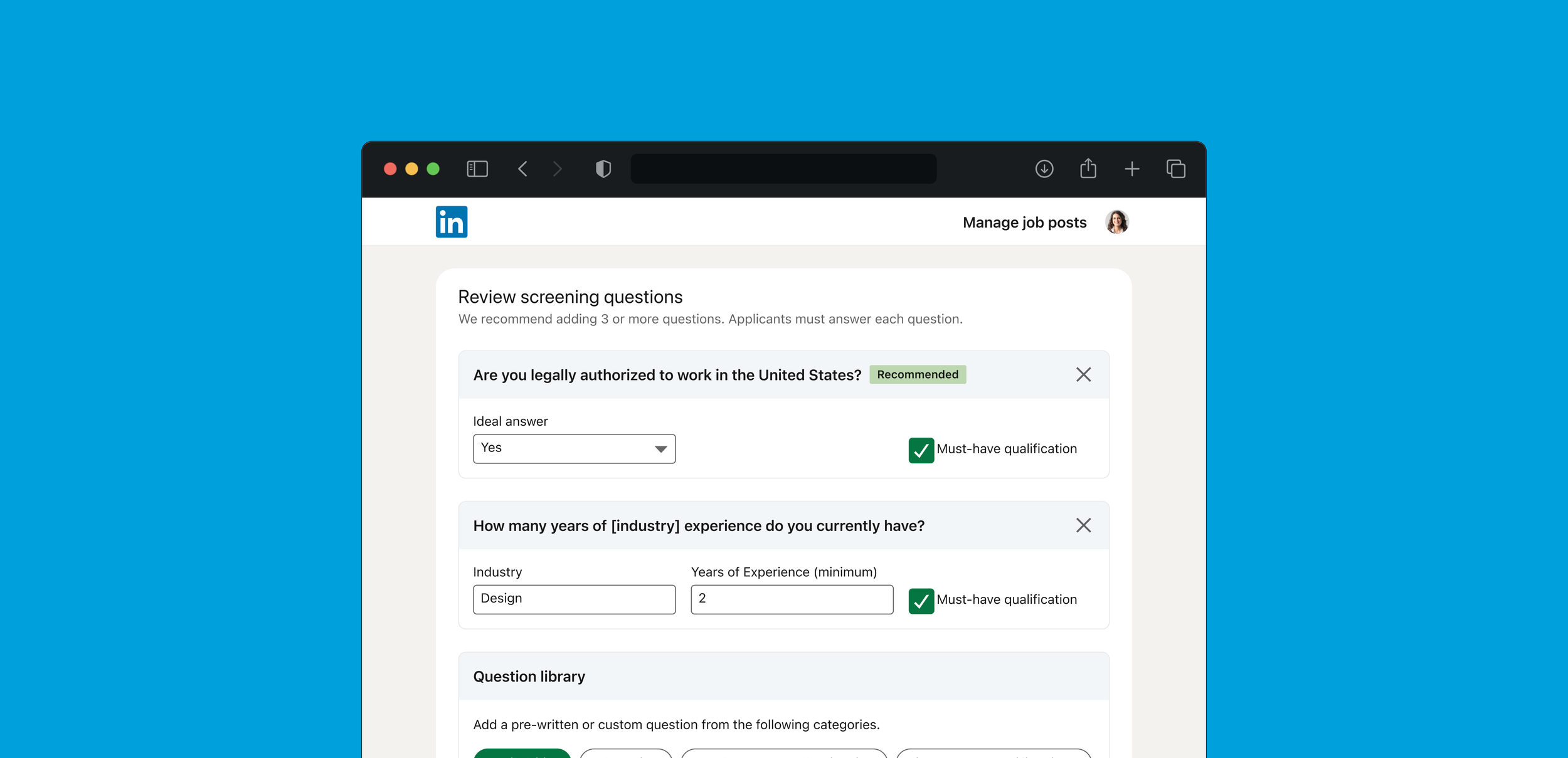
Question modules
Final DesignsCompared to the design explorations, all input fields became more balanced with each input occupying a third of the module width. In the previous design, there were questions with inline inputs that were represented by eight underscores when selected. In research we heard the lack of context represented by the underscores was confusing. From a design standpoint, the underscores also created an accessibility problem. We replaced each instance of underscores with bracketed text that explains what parameter inputs are available for that question.
We also implemented a new feature, recommended question template. Using explicit inputs (job description, skills, location) in the previous step of the job posting flow, a screening question would be recommended to the hirer.
Results & reflections
RetrospectiveThis project was a great exercise in cross-functional collaboration. It provided me the opportunity to work with partner teams and deeply understand their dependancies and use cases. We’re continuing redesign efforts on mobile and working towards feature and visual parity with the flagship experience.
With the introduction of categories, one feature I wanted to explore was a search function within the question library. I think the ability to search for a particular phrase or question would limit a hirer browsing the library to find the screening question they’re looking for.